Visualisation techniques can be incredibly helpful when trying to understand your data and any patterns of missingness. Different programming languages offer unique tools and packages to help with this. We will introduce a few visualisation tools for python and for R. Lastly, we will use some of these tools to show simulated visualisations of the fictional dataset with all three types of data missingness, as introduced in Missing Data Structures. If you would like to try the below visualisations, please recreate the example dataset (introduced in Missing Data Structures) in a file, which here we call “FictionalDataset.csv”.
Plot Types Covered and Hyperlinks
Python
The missingno python package is a great tool for visualising missing data. The main functions and their usage on the fictional dataset introduced in the previous subchapter are introduced below, where our dataset is in a dataframe format and called “df_fictional_dataset”.
# Importing packages
import pandas as pd
import missingno as msno

# loading in dataset
df_fictional_dataset = pd.read_csv("FictionalDataset.csv", header = 0, index_col = 0)
1. Nullity Matrix
msno.matrix(df_fictional_dataset)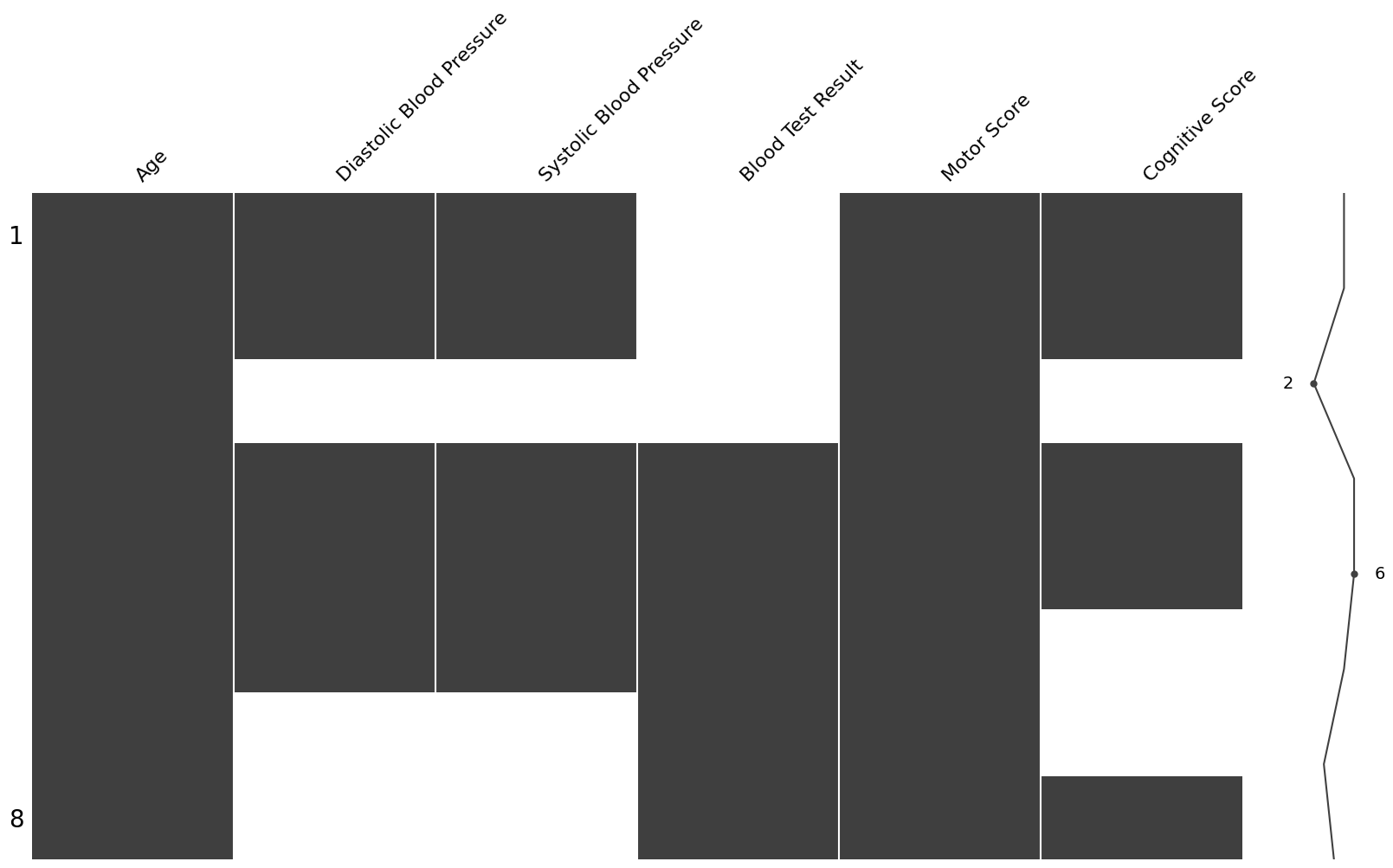
Figure 1:Nullity matrix of our fictional dataset, produced via the missingno python package.
Data entries with missing data are indicated by white, while all complete entries are shaded a dark grey. At the right of the plot there is a sparkline which summarises data completeness by row. In this instance, the 3rd row has the most missing data (only 2 complete entries), while the 4th and 5th rows are the most complete (no missing entries).
2. Nullity by Column
msno.bar(df_fictional_dataset)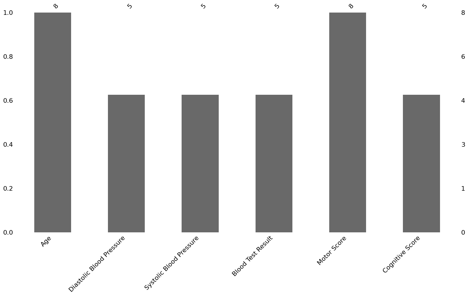
Figure 2:Barplot of the nullity per column of our fictional dataset, produced via the missingno python package.
This is a simplification of the first visualisation method; a simple bar plot showing the number of complete values per variable. The absolute number of values are shown on the top, while the left y-axis indicates the percentage of values that are not missing.
3. Nullity Correlation
msno.heatmap(df_fictional_dataset)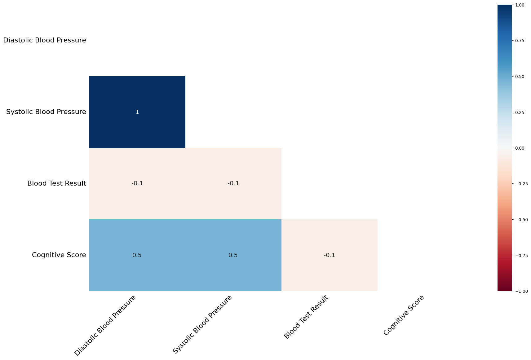
Figure 3:Pairwise nullity correlation heatmap of our fictional dataset, produced via the missingno python package.
Visualising what data is missing may not be enough to draw any inferences and understand the mechanism behind the missingness. A nullity correlation plot is one way to look into this. In this instance, we see that systolic blood pressure is always missing when diastolic blood pressure is also missing. Additionally, the cognitive score has a 50% chance of being missing if the blood pressure readings are missing. As the motor score and age don’t have any missing values these are excluded.
4. Beyond Pairwise Nullity Correlations, via a hierarchical clustering algorithm
msno.dendrogram(df_fictional_dataset)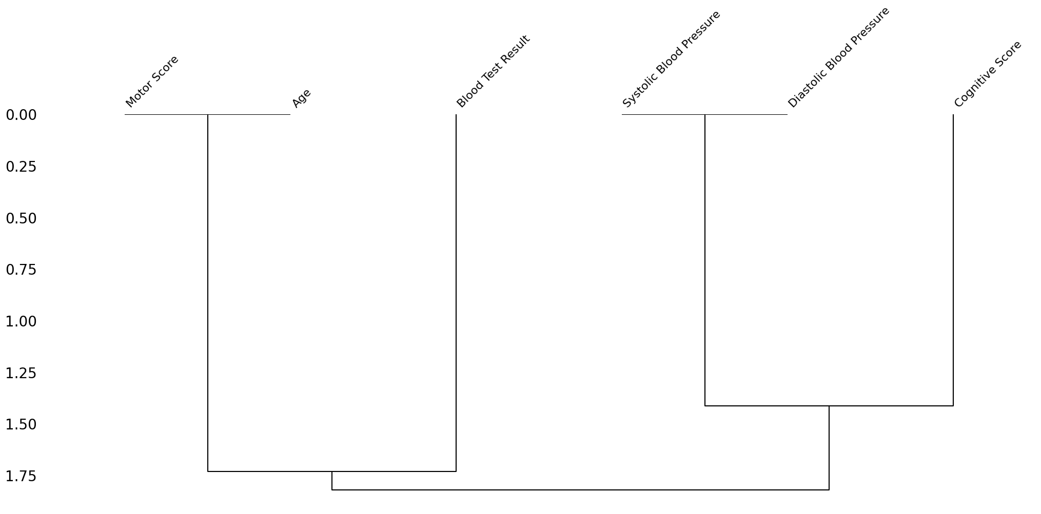
Figure 4:Nullity correlation dendrogram of our fictional dataset, produced via the missingno python package.
In the dendrogram, the missingness of variables that are linked at a distance of zero, are fully correlated with each other. Thus, we see the Motor Score and Age being connected at zero, and separately the two blood pressure measures being connected. Variables that branch close to zero, predict each other’s missingness well, but not perfectly. For instance, cognitive score branches from the blood pressure variables at around 1.30. This is because 2 out of 3 missing cognitive score values, also have missing blood pressure measurements.
The strength of the above visualisations are a lot more evident in a much larger dataset. You are encouraged to try them out on your own data to see for yourself!
Additionally, although these visualisations are useful, in our case, a visualisation looking at the correlation between the values and the missingness of variables would give us more information.
R
There are many readily available functions for visualising missingness in R, including many that look further into the mechanism of missingness. A couple of libraries have useful functions, namely: ggplot, visdat, and naniar. Similarly to the missigno package in Python, there are functions to visualise a nullity matrix or by column. For brevity, these will just be listed without the inclusion of figures.
fictional_dataset <- read.csv(file = "FictionalDatasetMiss.csv")1. Nullity Matrix
library(visdat)
vis_dat(fictional_dataset)
vis_miss(fictional_dataset)
2. Nullity by Column
library(ggplot)
gg_miss_var(fictional_dataset)
An interesting extension of the gg_miss_var function can help in pointing out the number of instances a given combination of variables all have missing data:
gg_miss_upset(fictional_dataset)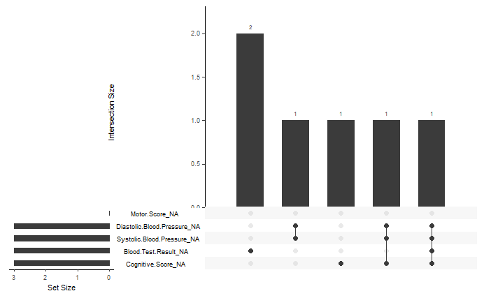
Figure 5:A bar plot showing the number of intersections of missing values between different variables. The total number of missing values in a given variable are shown by the set size bar plot in the bottom left corner of the figure. A table under the main bar plot shows the intersecting variables for a given bar.
3. Nullity Correlation
gg_miss_fct(x = fictional_dataset, fct = Blood.Test.Result)This function works slightly differently from the one introduced in the Python subsection. It shows the number of missing values per variable and per given value in a specified categorical variable. In this instance, the plot shows the number of missing values for every possible blood test result value (negative, positive, or missing). This could be helpful to visualise if missingness is associated with the value of a specific categorical variable (there is no relationship in our example dataset). For instance, men are less likely to fill out a depression survey; this would be immediately evident if population survey data was visualised with this function against gender.
4. Beyond Pairwise Nullity Correlations
library(naniar)

ggplot(fictional_dataset,
       aes(x = Motor.Score,
           y = Diastolic.Blood.Pressure)) +
  geom_miss_point()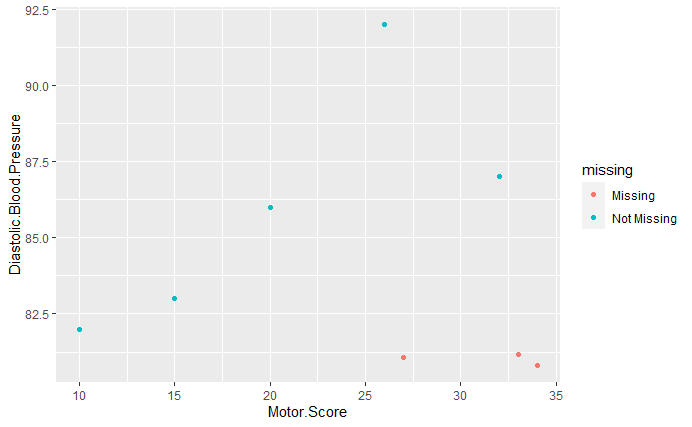
Figure 6:A scatterplot of diastolic blood pressure against motor score. Any missing values are plotted at 10% less than the smallest value of a given feature and are colored in red.
In Missing at Random (MAR), we mentioned that some study participants were unable to attend the blood pressure clinic due to being older and frailer. This is partially reflected in the figure, as most individuals with high Motor Scores, are missing their blood pressure readings.
However, an relationship observed does not necessarily equate to causation. Take the next figure as an example:
ggplot(fictional_dataset,
       aes(x = Age,
           y = Cognitive.Score)) +
  geom_miss_point()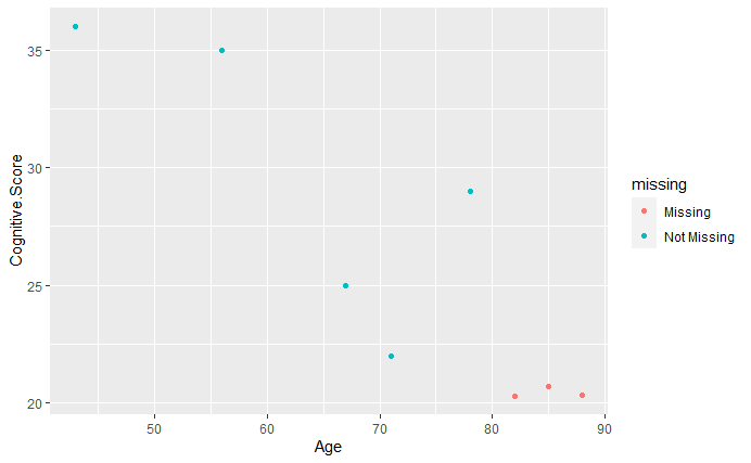
Figure 7:A scatterplot of cognitive score against age. Any missing values are plotted at 10% less than the smallest value of a given feature and are colored in red.
Here, anyone above the age of 80 does not have a cognitive score, so it may seem that being unable to complete the cognitive test is associated with being older. However, when we defined our fictional dataset, we also defined the reason for any missing cognitive scores. Specifically, those individuals had significant cognitive decline and had to withdraw from the study. Therefore, the correlation observed in the plot is just by chance (although it does theoretically make sense)!
Summary
In this sub-chapter, we have explored different tools to visualise missing data. Some tools simplify viewing any patterns, while others can even give insight into the mechanisms behind any missing data. This is by no means an exhaustive list of visualisation methods and functions available in these programming languages. Instead, this serves as an introduction to some useful tools and can be used as a starting point. The table below summarizes the functions introduced:
Summary Table
| Description | Python Function | R Function | R package |
|---|---|---|---|
| Nullity matrix | matrix | vis_dat & vis_miss | visdat |
| Nullity by column | bar | gg_miss_var & gg_miss_upset | ggplot2 |
| Nullity Correlation | heatmap | gg_miss_fct | ggplot2 |
| Beyond Pairwise Nullity Correlations | dendrogram | ggplot with geom_miss_point | ggplot2 & naniar |